I designed a food delivery app that focuses on a collaborative ordering feature and highlights a restaurant's brand identity as a part of my Google UX course via Coursera.
Design Challenge
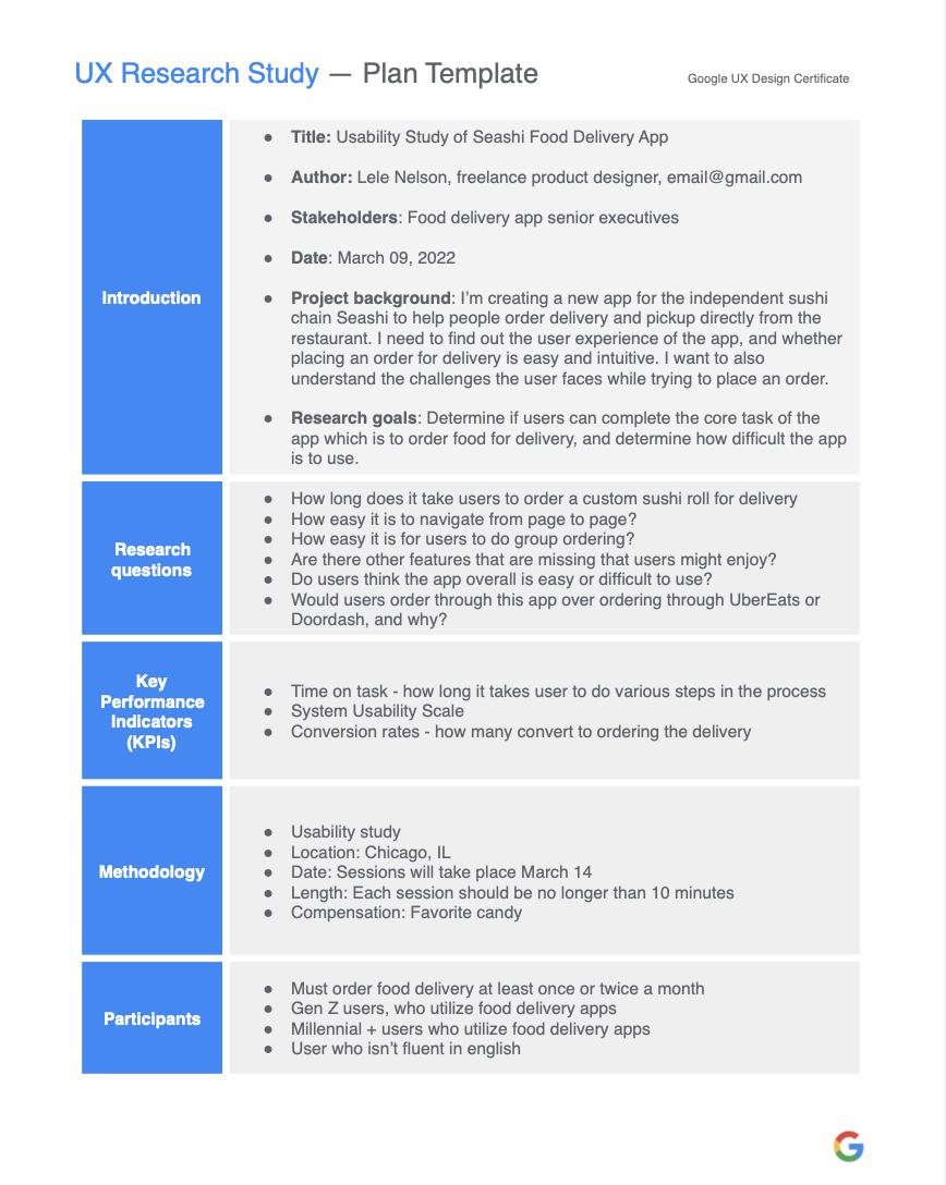
Develop a mobile application to support customer pickup and delivery ordering from the create-your-own sushi restaurant "Seashi" by addressing group ordering barriers and increasing ordering efficiency.
Timeline Tools Role
10 Weeks Figma, Miro, Adobe CC UX Researcher, Product Designer
Empathize
Overview
Food delivery apps became extremely popular out of necessity during the COVID-19 pandemic. However their adoption also comes at a cost for small local businesses. This project created a food delivery app for the pretend small chain restaurant “Seashi”.
Contextual Inquiry Research
In order to learn more about and empathize with potential app users to figure out their pain points, I conducted user research through conducting contextual inquiry interviews.
I targeted Millennial and Gen — Z users after conducting secondary research and finding that a large majority of 18–40 year olds have utilized a food delivery app in the last 90 days, greater than any other age group.
Dissecting User Insights with an Affinity Diagram
After 8 user interviews, I reviewed notes and transcripts in order to learn more about the user’s needs. To lay out my insights, I created an affinity diagram on Miro and determined insight clusters.
Key Research Takeaways
#1 ) There are priorities when choosing a food app to order from
Users prioritize fast delivery, good food options, discount codes, and app simplicity when choosing a food app to order from.
Users have anxiety around order arrival, timeliness, and correctness and will order from a restaurant with these priorities in mind.
#2) It's all about convenience
Users order delivery out of convenience when they don’t feel like cooking.
Users dislike when they cannot get questions answered by the menu on the app, and will abandon ordering process in this event.
#3) They usually know already what they want to order
Users usually already know what they want to order most of the time, and for the small percent of times when they don’t they can be influenced in-app by personalized recommendations. Users order from restaurants with good reviews, low delivery fees and delivery times, and based on familiarity.
#4) They like flexibility and freedom within the ordering process
Users enjoy having freedom to modify menu items to suit their tastes.
Users dislike when they have to pass the phone around for group ordering.
Define
User Flow Storyboarding
I created storyboards to take a step back and look at the bigger picture of the app, but also one to zoom in and really trace the user flow frame by frame. I wanted to dig in and get to work using some of what I learned in the contextual inquiry to empathize with our users actions.
What Else is Out There?
Competitive Audit
I wanted to understand what other products were on the market, and compare their strengths and weaknesses. In this new app, I need to make sure I am innovating on these existing competitor features to make the new app worth while.
Competitive Audit Key Takeaways
-Branding will be crucial to set the “Seashi” app apart since there are so many competitors in the space.
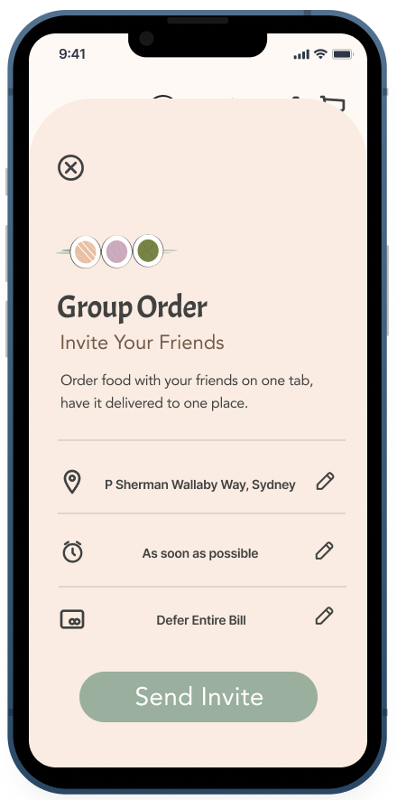
-Group ordering should feature an invite link, delivery address, scheduled time of delivery, and who will pay function.
-Simplistic and clean design promote efficiency, with industry standard icons to represent navigation.
Value Propositions
#1) Order Seashi food for delivery quickly when customers want it to satisfy hunger and suit busy schedules
#2) Ensure Seashi food arrives in a timely and efficient manner
#3) Allow an easy way to place group delivery Seashi orders without the hassle of word of mouth or passing around phones
Who will the app serve?
User Personas
In order to understand our users better and guide design decisions based on the key takeaways from my contextual inquiry, I created two user personas. These user personas were based on a combination of my contextual inquiry research, and my secondary research on food delivery app user demographics.
User Journey - Letty Moore, the Gen-Z Gastronome
I Created a Doing Thinking Feeling user journey for Letty specifically to really dig into the group ordering capabilities and how they will apply to Letty’s group ordering scenario. I wanted to empathize deeply with the frustration of group ordering where one or more users is not around to add to the order themselves, and that's a scenario from Letty Moore's persona.
Focus Scenario - Let's dig in to a case for group ordering
As shown above, my focus scenario involves Letty, the Gen-Z Gastronome. Focusing on just Letty's experience for this design sprint will help to make sure that group ordering capabilities are at the forefront of the app's creation.
User Persona
Letty Nelson
Focus Point
Letty is ordering food for delivery to her house for her entire family.
Who is Letty?
Letty is a very independent senior in high school, and wants to be able to order food for delivery for the entire family quickly, so that she won’t be hungry and have to rely on her parents to cook when they aren’t home just yet.
Core User Hypotheses
I created core hypotheses regarding the app design based on Letty’s focus scenario and my above research.
#1) Personalization is key
#2) Collaborative ordering will decrease anxiety and group order error.
#3) Collaborative ordering will give user’s self determination and flexibility.
#4) Branded visual design is important for making the app entertaining and drive users to use it over other delivery apps.
How Might We...
I crafted How Might We questions to begin the iteration process and generate ideas on how to address user needs based on the insight clusters from my affinity diagram and key takeaways.
How might we make the group ordering process simple and enjoyable for our users?
How might we make the menu and ordering process clear and effective for our users?
How might we inspire healthy excitement in our users as they patiently await their food?
Ideate
I began the ideation process informed by all of the above research. I focused on the How Might We statements above in the ideation phase to root my design in user needs.
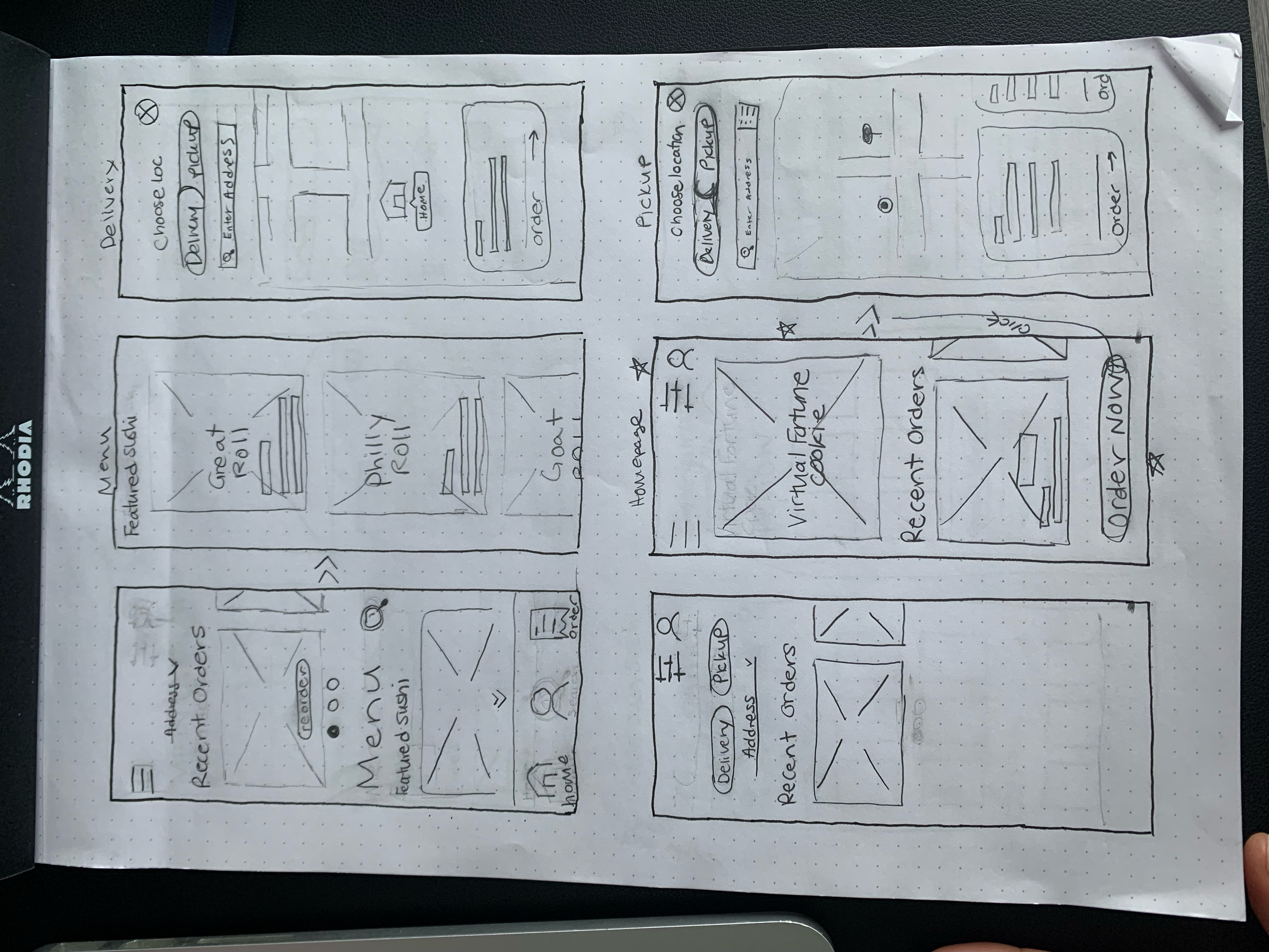
Crazy 8's
Using this design sprint method, I challenged myself to develop rapid sketches to offer me a bunch of design solutions for this delivery app. It helped to get the wheels moving to roll through to the wireframing process.
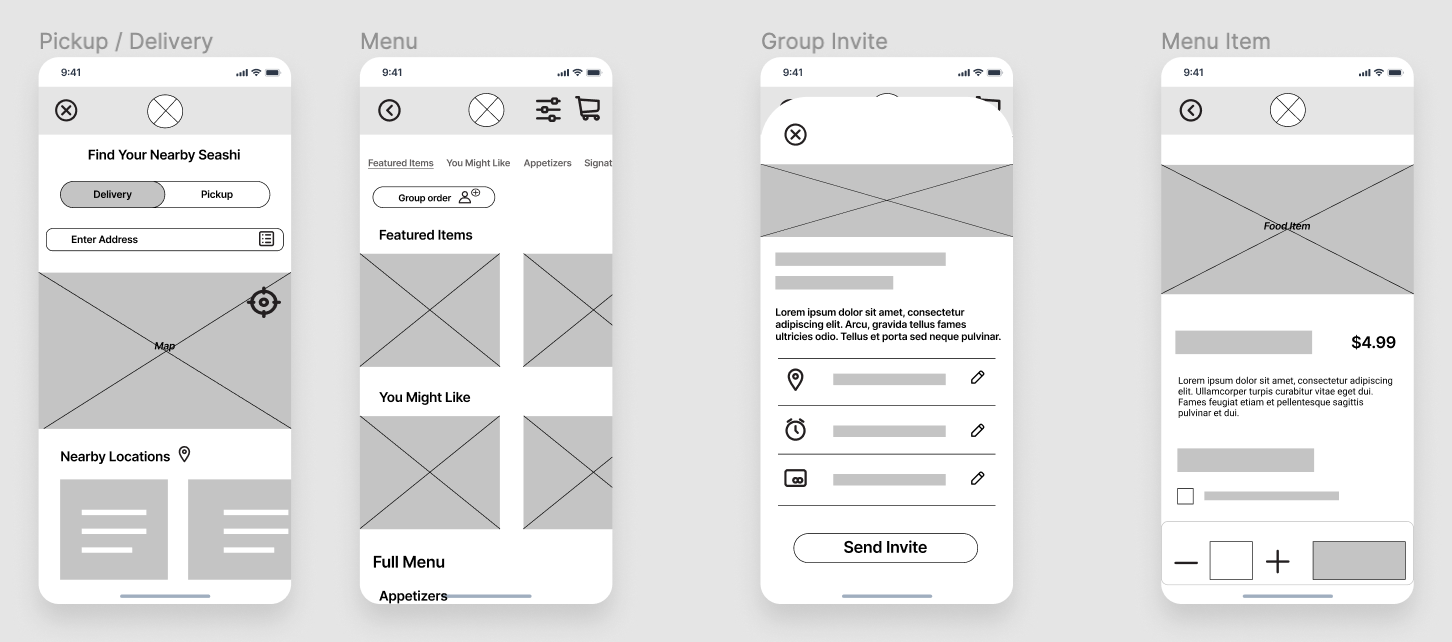
Low Fidelity Wireframing
Based on the a combination of analysis of key takeaways from my contextual inquiry, Letty Moore's user journey, and the overall design challenge goals I created rough paper sketches and Figma lo-fi wireframes as solutions.
Prototype
Hi-Fi Figma Prototype
I developed a clickable prototype using Figma to utilize in user testing.
Design Decisions - Highlights
Brand Identity on Home Screen
Since there already exists many food delivery apps, creating an app from scratch for an independent restaurant chain might not make the most fiscal sense unless it will pay off also in terms of brand recognition and identity. Having a fortune cookie image on the front screen can help orient users who are ordering from this asian fusion restaurant.
Group Ordering Feature is Highlighted
As the focus of this design sprint, the group order button is at the top of the menu page so that users can clearly access it and remember to invite friends or family to order with them.
Defer Payment Feature
For users like our user persona Letty Moore, they rely on their parents for money to buy food since they are still in high school. A defer payment feature will allow payment to be shifted from either the group orderer, or someone else in the group. The order cannot be placed without someone within the group taking account for the tab.
Small Menu Design - Horizontal Scroll
Since this restaurant focuses on customization, there aren't a lot of designated menu items. Having a horizontally scrolling menu under certain subtitles will help users to be able to scroll more quickly down the page to view the category of foods that are offered, but still allow users to scroll and see menu options available horiziontally under those categories of food.
Clear Icons to Highlight CTAs
To keep consistency with user expectations from other delivery apps, we kept the filter button and shopping cart button at the top right corner of the page.
Test
Usability Test
I conducted 4 usability tests where users were asked to complete a series of tasks that matched the user journey of Letty Moore, the Gen-Z Gourmand. I additionally asked feedback questions after each task to get their thoughts on the page as a whole and it's function.
Seeing the results of this test would further validate my design solutions, and provide feedback on what might need work as we go into the final design.
Main KPIs
-On average, users completed the tasks in less than 5 minutes.
-100% of users were able to complete the tasks. -Due to the low volume of people in this study, I actually did not conduct a traditional SUS, but instead asked users after they completed the test about their ease with completion. Everyone said completing the tasks was "easy".
What they liked...
-Loved the idea of group ordering and felt it was seamless and exactly what they wanted from a delivery app.
-Found the customization process for create-your-own rolls to be straightforward and easy to carry out the task of adding their order to cart.
-Some liked that they could remove people from a group order on the delivery details page.
-Thought the app was really pretty.
What they didn't like as much...
-The horizontal scroll on the menu was not fully prototyped and was therefore seemed confusing to users on how to access more menu items.
-A horizontal menu didn't jive with user expectations of a menu. -Others expressed concern that they would press the remove person from group order button by accident.
-Users were not sure if their group order invite sent.
Reflect
As a starting design, the feedback on this project was super helpful to fuel my next design iteration.
Next Product Improvements
-Get rid of horizontal scrolling on menu: This broke with user's expectations and so a redesign of the Seashi Menu page is in order.
-Have an error prevention module present after a user clicks to remove a person from a group order to make sure that they don't accidentally click to remove a person from their group order.
-Provide users with system status updates by giving a success toast or pop up to let users know they successfully sent a group order invite.
Final Thoughts
As a foodie, this project consistently made my tummy rumble. Thanks to the friends and family that participated in my usability study! I think taking notes more on the general process would be helpful to make sure that I am capturing what I did here, as writing this case study was like digging back into an old closet. I got very cozy with Figma on this project and decided it's my favorite UX tool.